Showing posts with label Limited Edition. Show all posts

Saturday, July 21, 2012

TEASER: NORDSTROM ANNIVERSARY SALE HAUL


Now that Nordstrom’s Anniversary Sale is in full swing and my wallet has dropped a solid 10 pounds – a situation where weight loss is really, really bad – I thought I’d tease you with my new goodies. (I seriously cannot wait to play dress up and show you what I come up with!) My lighting is terrible because it’s raining, but I think you can see well enough to get a general idea of what everything is. I have been really good about not shopping over the past few months, but I got a little carried away this time around! My shopping trips were spread out over a few days, so I didn't realize how much I had actually purchased until I started to put this post together. Yikes!

Right to Left, Back to Front: Arcona Triad Pads
Cle de Peau Concealer, Nars Joie de Vivre, Chanel Sable Emouvant
Chanel Vitalumiere Aqua, Chanel Giggle, Dior Amazonia, Chanel Vertigo
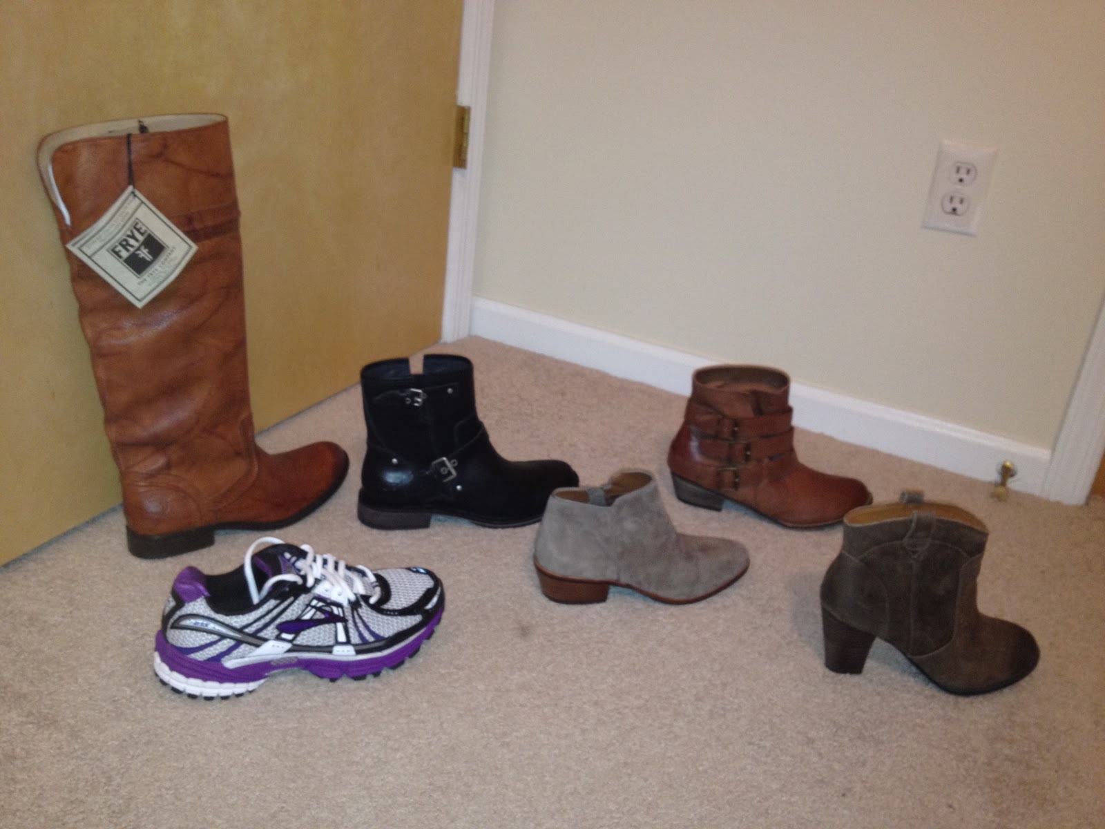
Right to Left, Back to Front:
Frye Melissa Trapunto, Ugg Fabrizia, BP. Rally
Brooks Adrenaline GTS 12, Sam Edelman Petty, Indigo by Clarks Heath Harrier
(The black Ugg Fabrizia boots are definitely going back. They're very uncomfortable!)
Frenchi Vanity Tweed Jacket, Halogen Collarless Tweed Jacket, Olivia Moon Ruched Sleeve Jacket
Joie Pearline Blouse, Halogen Pin Tuck Pleat Blouse, Twenty Leather Panel Tee
Halogen Pleat Front Check Skirt, June Rabbit Fur Vest, Hinge Fitted Leather Jacket

I’m either going to do a video or more detailed post that shows you the items in better detail. In the meantime, if you see something you like, get a move on to Nordstrom or the online store before it’s all gone! Keep an eye out for styling ideas and beauty reviews coming in the next few days. Don't forget to subscribe to my blog for updates!

Hope you all have a great weekend!

Tuesday, February 7, 2012

DIOR GARDEN PARTY: GARDEN PASTELS REVIEW


Despite the release of a spring collection in January being somewhat cruel and taunting, the romantic pastel shades in Dior’s new Garden Party collection were just the pick-me-up I needed. Upon opening any of the pieces from the launch, I feel like I’m suddenly enclosed in a lush rose garden. I can almost feel the warmth of the sun and smell the sweet floral-scented air.  (Too bad it’s actually a cold snowy evening.) One of my favorite products from the collection is the Garden Pastels (#441) eyeshadow quint. The colors are pigmented, long-wearing and work together beautifully.  In short, it is the total opposite of the holiday Couture Golds dud.

In natural light. No flash.

PACKAGING: Garden Pastels comes in Dior’s traditional navy blue lacquered eyeshadow case that is about the size of the palm of my hand. When opened, the palette contains a full mirror, 5 rose-embossed eyeshadows, and 2 double-ended sponge applicators. Everything comes housed inside a navy blue velvet pouch.

PRICE: $59 for 5 eyeshadows (0.16 ounces of product) and 2 doubled-ended sponge tip applicators.

EYESHADOWS: I was a little apprehensive about buying another Dior palette after my disastrous encounter with the holiday Couture Golds quint, but I’m so glad I picked up Garden Pastels! Even without a primer, the eyeshadows are buttery smooth and pigmented; however, I find the color is most intense when I use the applicators.  When I use a brush, the eyeshadows apply slightly more sheerly, but they layer nicely and blend beautifully into each other. If you want to create a really dramatic look, I suggest using a colored base and layering the Dior eyeshadows on top because although pigmented, the colors are on the lighter side. Each eyeshadow is impressive in terms of texture, wear and color payoff – there are no duds here!

In full sun. No flash.

The shades included in this selection are quite shimmery and colorful, so they’re not for the faint of heart. That being said, I think they can be muted so that even neutrals-lovers will feel comfortable using this palette. I have blue eyes and think this looks nice on me, but I imagine these colors will look especially gorgeous on people with brown eyes. The colors in this palette remind me of the Giorgio Armani Spring Luce d'Oro Eye quad in #1, although I haven't seen the Armani palette in person to be able to say for sure.
            Spring Green: Shimmery spring green. Despite the shimmer, it doesn’t feel gritty.
            White: Shimmery white with a hint of green iridescent sheen. Smooth texture and good
            color payoff. (This reminds me of Mac's Vanilla pigment.)
            Pale Yellow: Shimmery buttercup yellow. Good color payoff and grit-free.
            Teal: Shimmery teal with hints of gold. Quite pigmented with a smooth texture.
            Pale Pink: Shimmery pale petal pink. Smooth texture, and decent pigmentation. (It’s  
            somewhat sheer compared to the other shades, but it still builds well.)

SWATCHES:
In full sun. No flash.
Green, White, Pale Yellow, Teal, Pale Pink

APPLICATORS: Although sponge tip applicators usually have a bad reputation for being flimsy and useless, I actually love the ones that Dior produces. Garden Pastels has two double-ended applicators, each with an eyeshadow and eyeliner side. The thicker end is useful for packing on color to the lid, crease or brow. The longer, thinner end is excellent for lining the upper and lower lashes.

OVERALL VERDICT: At $59, Garden Pastels is definitely an investment; however, I think it is money well-spent. The colors work well with each other (which isn’t always the case with small palettes) and blend exquisitely.  Every eyeshadow has a smooth texture with good color payoff. They apply best with the applicators, but can be layered to the desired intensity with brushes. This is how a designer palette should perform!

Monday, January 30, 2012

DIOR GARDEN PARTY: TULIP PINK REVIEW


I'm a sucker for limited edition makeup, so it's no surprise that I picked up quite a few items from Dior's new Garden Party collection. My favorite lip product from the launch is the Tulip Pink Rouge Dior lipstick (#448, $32 for 0.12 ounces). It’s a pink with a hint of coral and a cream finish. This lipstick feels much smoother on the lips than Dior’s other spring lipstick – the frosty Corolle Pink – nor does it settle into my fine lip lines.

In full sun, no flash.

I was expecting Tulip Pink to be a “my lips but better” shade, but it's too bright to fall into that category. The color initially seems somewhat sheer when applied, but it builds nicely to semi-opacity. I think this feature will make Tulip Pink the more popular of the collection’s lipsticks because it will suit a greater variety of women. Tulip Pink will probably work best with warmer/neutral skin tones, but it seems like it could be universally flattering. This shade looks nicer with my fair skin than I anticipated, but I think it will look better when I've had a little bit of sun. I know I'll get a lot of use out of this lipstick during the spring and summer!

In full sun, no flash.

Tulip Pink compared to the other "Garden Party" lip products:
Tulip Pink lipstick, Corolle Pink lipstick and Pretty Rose lipgloss.
Indoor natural light, no flash. 

Wear time seems to be on par with my other Rouge Dior lipsticks, although I still don’t believe Dior’s claims that this formula is long-wearing. I get about 3-4 hours of color from each application if I don’t eat or drink anything. This formula has a good amount of slip, so it’s moisturizing and comfortable on the lips; however, that slip also contributes to the color wearing off more quickly than compared to a drier formula.

OVERALL VERDICT: I love Tulip Pink because it instantly brightens my face without being overwhelming or looking like I’m trying too hard. It can be worn as a subtle wash or built up for a more intense look. The pinky-coral color will transition well through the warmer seasons, which makes the initial $32 price tag seem a little more reasonable.

Tuesday, January 24, 2012

DIOR GARDEN PARTY: COROLLE PINK REVIEW


Although winter has been unusually skimpy on snow where I live, I’m still sick and tired of the bitter chill and dreary gray tones that meet me once I step outdoors. When there’s no end in sight to those dreaded winter doldrums, I pray to the makeup gods for some colorful relief.  And this season, Dior answered – and big time! – with the romantic limited edition Garden Party.

Corolle Pink in natural light, no flash.

Among the items that I purchased from Dior's new collection, the first that caught my eye was the Corolle Pink Rouge Dior lipstick (#363, $32 for 0.12 ounces). It's a delicate and somewhat sheer frosty baby pink that is chock full of silver shimmer. Even though the grains of shimmer are small, Corolle Pink feels a bit gritty on my lips. I don't find it to be uncomfortable, but some women might.

In full sun, no flash.
With flash.

Corolle Pink isn’t the most pigmented Rouge Dior I’ve ever tried, but it still has better color payoff than the more sheer Dior Addict formula. The color shows up on my light lips, but I think women with more pigment in theirs may want to skip this lipstick in favor of the Tulip Pink Rouge Dior (comparison swatch below). I love the soft shade of this lipstick – it is the perfect pale pink with my fair complexion.

Corolle Pink compared to the other "Garden Party" lip products:
Tulip Pink lipstick, Corolle Pink lipstick and Pretty Rose lipgloss.
Indoor natural light, no flash. 

Wear time seems a little less than compared to my other Dior lipsticks, but that could be because the color is light and not as noticeable. Corolle Pink isn’t longwearing, but it lasts about 2-3 hours if I don’t eat or drink anything. 

I usually find the Rouge Dior formula to be rather hydrating and forgiving . However, the intense shimmer in Corolle Pink emphasizes lines and dry or flaky lips, so make sure to exfoliate and moisturize beforehand! Unfortunately, no matter how much I prep my lips, I feel like this color accentuates how cruel the winter has been to my skin. Perhaps my problem will be resolved when the spring arrives.

OVERALL VERDICT: I think reviews for Corolle Pink are going to be divided in terms of rants and raves because of the frosty finish and medium color payoff. If you want a natural look, I would definitely avoid this shade and go for the Tulip Pink; however, if you want a wash of shimmery color, this could be right up your alley. At $32 a pop, I recommend trying Corolle Pink at a Dior counter before purchasing it. Although I adore the  color, it makes my lips look like a chapped mess (even when they aren't). I’m torn between returning this lipstick or keeping it in hopes that it will look better on me in warmer weather. Overall, I think this is just an average product and not worth the expensive price tag.


Saturday, January 7, 2012

DIOR GARDEN PARTY HAUL PREVIEW

Dear Readers,

I hope you're all having a pleasant weekend! I've had a lovely, lazy Saturday. My boyfriend, Ed, is visiting his family for the weekend, so I've been delighting in activities that take a back seat when he's home. I slept until 8:15, did some yoga, went to the mall and bought some makeup, filmed a video  – okay, I was somewhat productive today – did some crossword puzzles while drinking green tea, knit a few rows in the hat I'm making for my nephew and watched The Help.

Tonight, I'm putting my cell phone on the silent setting and taking a Lush-ious bath until I'm pleasantly pruney. (Yes, I know it's a Saturday night and I'm taking a bath instead of going out. I couldn't look forward to my evening more, but perhaps this is a sign I'm getting old.) I'm thinking of cocktailing the Big Blue bath bomb with the Floating Island bath melt and either the Sea Vegetable or Figs & Leaves soap. Aaaahh, I feel relaxed already!

Before I slip into a blissful soak, I want to tease you with my purchase from Dior's new Garden Party spring collection. The colors look so beautiful, albeit predictable for this time of year; however, I never tire of romantic, delicate shades. They just scream "ladylike" to me. Please excuse the poor lighting and dark stains at the bottom of the photos. I spilled a jar of brown pigment on my makeup drawers and need to wipe down the top again.

Items featured are the Milly Garden clutch, Garden Pastels quint, Garden Roses quint, Tulip Pink lipstick, Corolle Pink lipstick, Waterlily nail polish and Pretty Rose lipgloss.

In the waning hours of daylight -- no flash.
Waning daylight -- flash.

More information coming soon. I have a feeling it's going to take me a few days to swatch these because I don't want to ruin the pretty floral designs. I guess that's what happens when makeup and art collide!

Until next time,

-BeachBlondeBeauty


Wednesday, December 7, 2011

LUSH ABOMBINABALL BATH BOMB REVIEW


When the temperature drops outside, I love nothing more than to slip into a hot bath.  Seriously, soaking in a “tricked out” bath is my idea of heaven on this marble planet. Thus, after my recent shopping spree at Lush, I was faced with a difficult decision: which delightful bath time treat(s) should I use first?

I knew I wanted to try one of the bath bombs I purchased from the holiday collection. I was leaning towards using Abombinaball ($6.95 for 6.3 oz) over Golden Wonder because I loved its peppermint and vanilla scent. I also couldn’t resist the abominable snowman's goofy face, which made me smile.
Abombinaball Bath Bomb (Photo taken from Lushusa.com.)

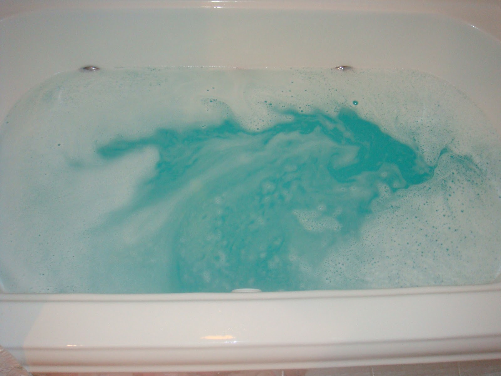
After much deliberation, I chose to cocktail my bath by pairing the Abombinaball bath bomb with the almond scented Melting Snowman bath melt. (I waited a few minutes after Abombinaball had dissolved completely before I added the Melting Snowman because I wanted to see how Abombinaball performed on its own first.) I tossed Abombinaball into the running water and watched it dance along the surface, leaving plumes of blue and white in its wake. As the bath bomb dissolved, the water slowly turned into a stunning glacial blue with hints of frothy white foam on top. I felt like I was on a trip to the Arctic watching glaciers calving…only significantly warmer and safer.

Glacial blue water with frothy white foam remained
after Abombinaball had completely dissolved. 

Although the foam lasted for only a few minutes, the
 colorful water remained for the duration of  the bath. 

I didn't think to take photos until after Abombinaball disappeared, so I apologize for not being able to show you how this bath bomb dissolved. I've learned my lesson and will be better prepared next time!

Unfortunately, although I liked the show that Abombinaball put on, I did not wholeheartedly enjoy my bath while using it. I noticed that the bath bomb’s scent changed once it encountered water. What had been an enticing sweet and minty aroma when Abombinaball was dry turned into an unpleasant burned coffee odor as soon as it started to fizz in the tub. Luckily, the smell didn’t linger on my skin afterwards, but it did rush me out of the tub sooner than usual. It’s a shame that I couldn't stand the scent because Abombinaball was quite moisturizing even without the bath melt (kind of like Butterball) and left my skin feeling silky smooth.

Overall Verdict: This bomb was fun to watch dissolve and created a beautiful looking bath. If not for the odd scent when in the water, I would have repurchased this because it created a soothing, moisturizing bath that left my skin soft to the touch.

Sunday, December 4, 2011

LUSH HOLIDAY COLLECTION HAUL


A Lush haul featuring items from the limited edition 2011 holiday collection. I also bought bath products from the permanent line, but I split the video into two parts because it was fairly long. You can read my review of the Abombinaball bath bomb here.

Have you tried any of these items? If so, what did you think? What are your favorite holiday bath/shower/body products (from any brand)?


Items featured:
-Christmas Eve Bubble Bar
-Abombinaball Bath Bomb
-Golden Wonder Bath Bomb
-The Melting Snowman Bath Melt
-Snow Globe Soap

What I'm wearing (Watch the tutorial here.):
Eyes: Chanel Beige Lame, Mac Blanc Type, Urban Decay Zero 24/7 Eyeliner, Makeup Forever Aqua Eyes in 9L (gold), Mac gold pigment from the Surf the Ocean Pigment Stack, Sephora Advanced Lash Booster Mascara in Black
Cheeks: Laura Geller Baked Cheek Dreams in Neapolitan
Lips: Chanel Triomphal
Face: Chanel Vitalumiere Aqua, Garnier Anti-Dark-Circle Roller, Mac Blot Powder, Tarte Maracuja Creasless Concealer


Thursday, November 17, 2011

DIOR COUTURE GOLDS EYESHADOW PALETTE REVIEW (LES ROUGES OR HOLIDAY COLLECTION)


I’ve always admired Dior’s eyeshadow palettes. Whenever I would walk by one in a store, I would stop, swatch, and drool (away from the tester, of course). Then I would promptly sigh and walk away, all the while wishing I could bring myself to spend so much money on makeup. Most recently, I was attracted to the Les Rouges Or Holiday 2011 display.

The shadows seemed right up my alley – tinged with gold, but still fairly neutral. While in the store, 4 of the 5 shadows swatched like a dream on my fingertips. Thus, after years of pining, I finally caved and bought my first Dior eye palette: the 5 Couleurs Eyeshadow Palette in (554) Couture Golds.


After driving 90 miles per hour and nearly causing several traffic accidents (I kid, I kid.) I arrived home and excitedly opened my new treasure. The palette comes in Dior’s standard packaging: tucked inside a black velvet pouch is a navy blue lacquered case with “Dior” embossed in silver atop a pearly blue “CD” holograph. It contains 6 grams/0.21 ounces of shadow and cost $59.


Despite having a beautiful mix of colors, this palette was an utter disappointment. As I mentioned, most of the shadows seemed very pigmented and silky on my fingertips. It wasn’t until I tried creating a few looks with brushes that I realized I had been deceived.


Colors breakdown (from top left to right, center is last):
  • Shimmery white with a hint of champagne. Buttery smooth and extremely pigmented.  Excellent for highlighting the inner tear duct and brow bone (although it did emphasize my need for a good tweezing). Blended easily.
  • Shimmery bronzed gold. Buttery smooth and seemed pigmented when swatched, but poor color payoff when applied on the lid. Required multiple layers to have the shadow show up as expected.
  • Matte espresso with gold and red microglitter. It appeared to have real depth and dimension in the pan, but was nothing special on the eye. Very chalky and applied unevenly.  Sheer and required multiple layers to create tolerable color intensity. Difficult to blend.
  • Shimmery antiqued gold. Buttery smooth with excellent color payoff.  Blended easily. This was my favorite color of the palette, but it was a bit too similar to my skin tone (NW20 in MAC) to show up as intensely as I would have liked.
  • Pale gold with gold microglitter. Extremely sheer and difficult to build. When applied, the gold is very faint and all that jumps out is glitter.  Prone to a lot of fall-out. Reminiscent of Urban Decay Midnight Cowboy Rides Again … for grown-ups.
Regular color intensity. White, bronze, espresso, antiqued gold, pale gold. (Yes, the pale gold is there. It's that sheer.)


Concentrated color intensity. White, bronze, espresso, antiqued gold, pale gold.

The looks that I have put together at home took so long and required extra work to make the shadows behave the way I wanted them to.  I don’t know too many women who have the time or patience to spend over 10 minutes on what should be a 5-minute eye.

And because all of the shadows looked pretty much the same on my lid (with the exception of the dark brown), the colors appeared muddy even without blending. Blending required an extremely light hand or else most of the color intensity disappeared, especially with the dark brown.  Also, even worn over a primer, I found that the colors faded over the course of a few hours. Christine from Temptalia rated this palette a B+, but I have to respectfully disagree. Perhaps this is more flattering on warmer skin tones because it brings out the golden nuances of the shadows? Regardless, this was an expensive mess on me.

Overall verdict: Beautiful in the pan, not so beautiful on the eyes.  For the damage done to my wallet, this palette should be of a much higher quality. Instead, it was a complete disappointment and will be returned. 

Wednesday, November 16, 2011

NAIL NEWS: DIOR VERNIS MERVEILLE REVIEW (LES ROUGES OR 2011 HOLIDAY COLLECTION)


Red nail polish in a holiday collection? How original! Ok, maybe not, but there’s just something I can’t resist about shimmering red fingertips when the air is crisp and ripe with holiday cheer. I’m a sucker for any shade of red this time of year, but I fell especially captive to the nail polishes released in Dior’s 2011 Les Rouges Or holiday collection: Apparat and Merveille.  The former, a lovely ruby red, reminded me too much of Sephora by OPI’s What’s Your Pointsetta. I couldn't think of any dupes for the latter, so it came home with me.

In the bottle, Merveille ($22 for 0.33 fl. oz.) is a fire engine red with shimmery gold veining. I find the color to be much more multifaceted in the bottle than when worn. On the nails, there is a subtle shimmer only when the light strikes it. When not near a good light source, Merveille seems more like a cream with a slight metallic sheen– still pretty cool looking, though. The color is cherry red on me, but it might lean more orange on individuals with warmer skin tones.

All too often, I encounter nail polishes with thin consistencies that streak and require multiple layers, but Merveille was different. The formula was fluid and applied easily on the nails. The polish was opaque in one coat (yaaaay), but I prefer it with two. In terms of wear, I got a solid week with only minor tip wear – not uncommon for Dior. The polish chipped on the end of the 7th day after I had been scrubbing some stubbornly dirty pans. Had I worn rubber gloves, I imagine I would have gotten a few extra days out of my manicure.

Overall verdict: This is a beautiful, well-performing polish. It’s not the most unique shade, so you may want to save your money and get a dupe. However, in terms of quality, it’s worth the price.